E.ON – Right product for you
E.ON wants to help their customers to select the best product that they offer. The current visual designs are dated. E.ON would like the new pages designs to align to the current brand guidelines. Pages redesigns were required for the Get a quote, Switch tariff and Tariff overview pages.

Research and testing
Research were undertaken by user interviews and user testing. During the user interviews, it has revealed that the users had preferred using desktop or tablet devices to view content from the website. Some users preferred to contact E.ON directly via phone because they do not understand the difference between each tariff.

Working alongside a user experience designer, various wireframes were created to test a way of how the tariffs are shown that would allow the customer to compare. They preferred components that contained a short information of tariff details that can be easily identified the difference between each tariff. Rather than the click through information that is currently displayed in the design. We also noticed that the user would like a better filtering system as they find the list of tariff shown after the results can be overwhelming.
Defining a goal
- To update the visual design to align current brand guidelines
- To add the filtering feature to help customers to find the best product
- To educate the customers of different products that E.ON offers
Design
A combination of old and new components were used. The new components were created to fit the purpose of helping the user to have the option to filter tariffs based on user research. I had to work closely with the brand team in Berlin to ensure brand consistency across all touchpoints.

Get a quote page
User journey: Non customers who wants to get a quote on E.ON’s tariffs
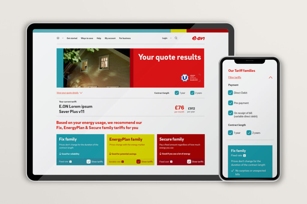
This is a page where the customer gets the quotes results based on the details they have entered prior landing to this page. Colour was used to code different tariff categories , this can be seen on the tariff filters at the top of the page, which includes information of the tariffs so the customer can instantly select / deselect tariffs to filter.
The tariff information is also colour coded and sectioned in tables of columns so it makes it clean, simple to compare against the other tariffs. If the customer wants to see more details about a particular tariff, an information modal pops up once the customer selects a tariff.
Tarrif overview page
User journey: New customers who wants to see what tariffs E.ON offers.
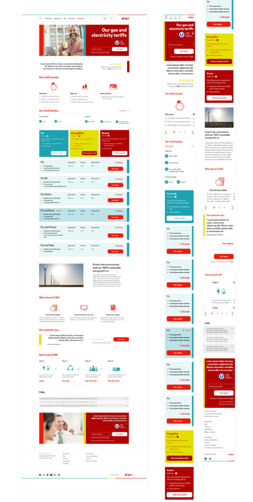
This is a page where new customers gets a range of information on what tariffs E.ON offers. It includes review components, iconography step-by-step components to explain the ease of joining E.ON and also FAQ’s. The tariff components from Get a quote and Switch tariff pages are also included, but it does not show the price information because the customer has not yet entered details to get a quote.
