Mighty Hikes
Design and build a microsite for Mighty hikes, hosted separately from the main website.
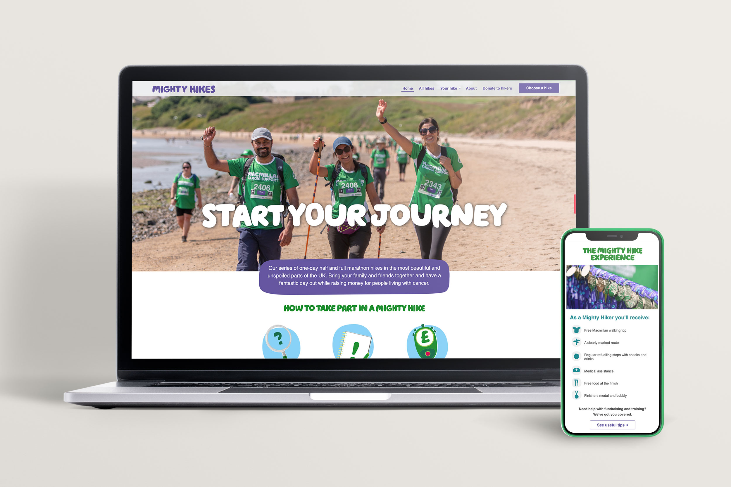
Mighty Hikes is a growing fundraising product for Macmillan Cancer Support, currently raising around £5m p/a, it’s seen as a major growth area in the short to medium term for driving fundraising income.
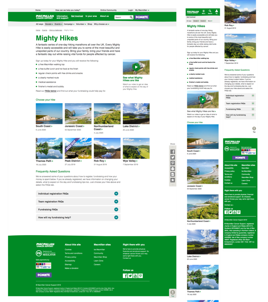
The problem
What is Mighty Hikes?
User feedback has highlighted to us that often content is difficult to find, and contextual information about what the event actually is, is hidden.
Where can I find out more information about the event?
The participants of the event often contact the contact center to find out more information about the event because they could not find the information they need on the page. This could potentially impact the contact center colleagues’ workload and not able to support those who are more in need to talk to our support line.
Not enough content for ‘buying into’ the event
Based on not having enough information for the participant to help them make a decision, there could be a potential to impact the volume of registrations, which could affect the fundraising target to help people living with cancer.
Content structure
Working closely with UX Designer and Content editor, user flows, navigations and wireframes were created.
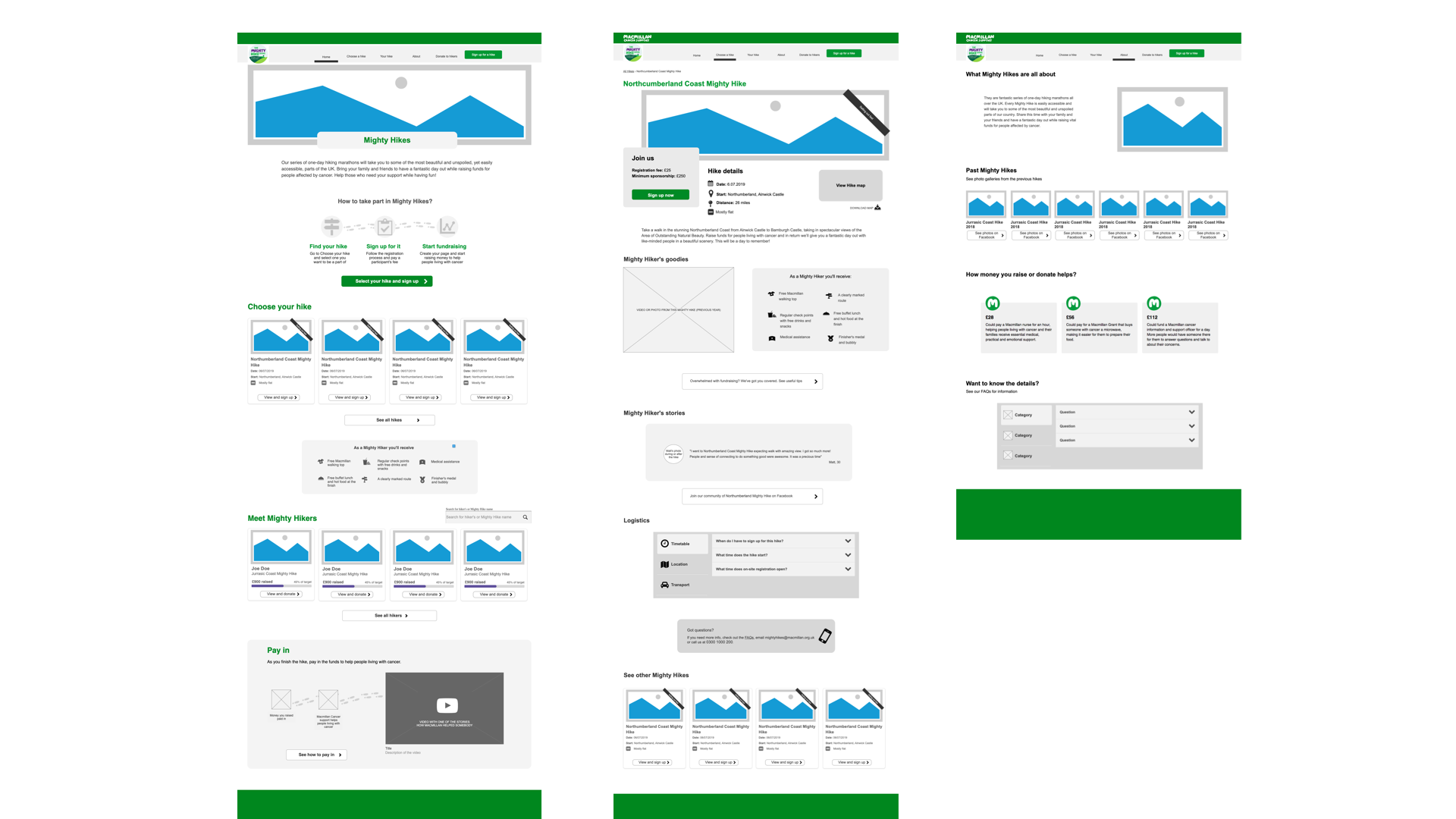
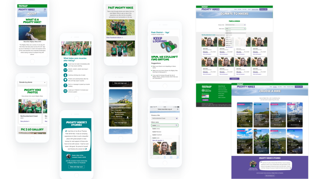
Various pieces of information are included in content pages, for example, tips, testimonials, photos, and benefits of signing up for a Mighty Hike – This was a pain point for users, it was a piece of important information lacking from the previous content, which was usually found through marketing campaigns, in social media or direct mailers received through the post.
Ideation
I began with competitor analysis on direct and indirect competitors. To analyse the visual language and trends for the target audience.
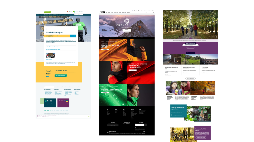
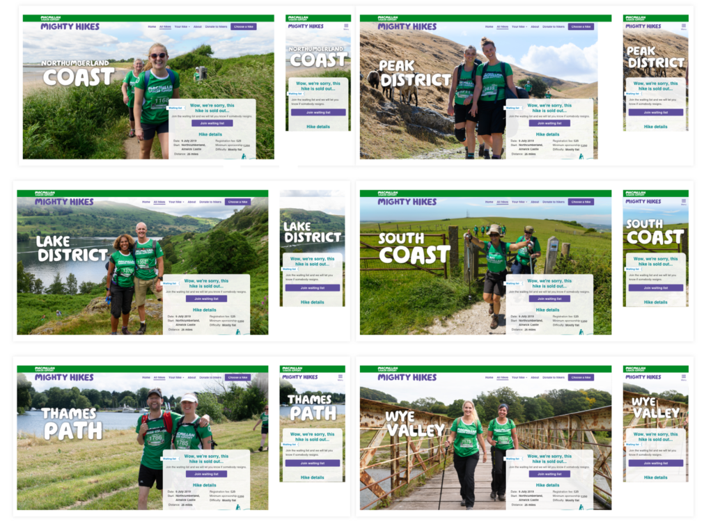
The stakeholder have provided information on how photography is popular amongst Mighty Hike social community, so I was looking at opportunities to use photos taken at Mighty Hike events.
Design
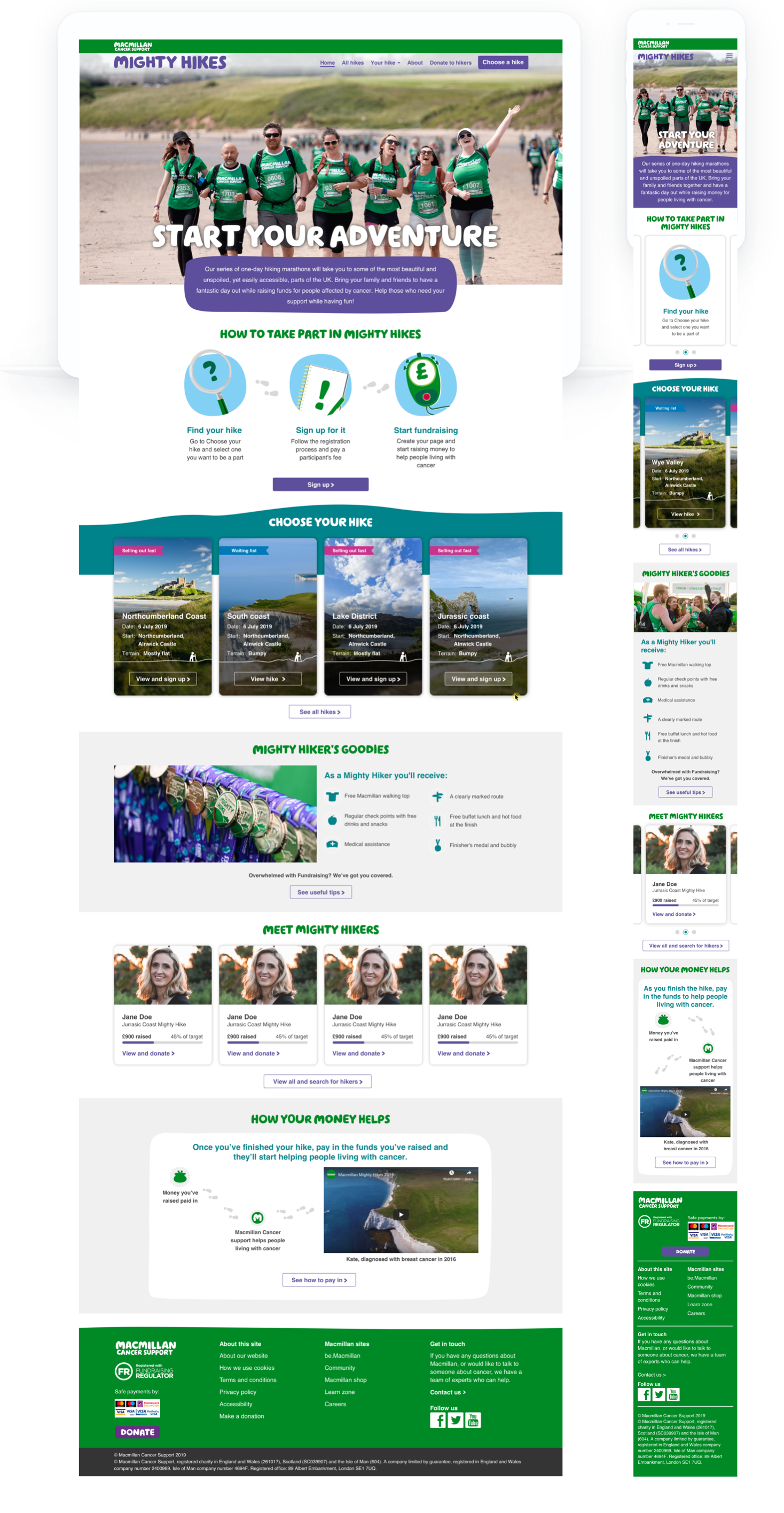
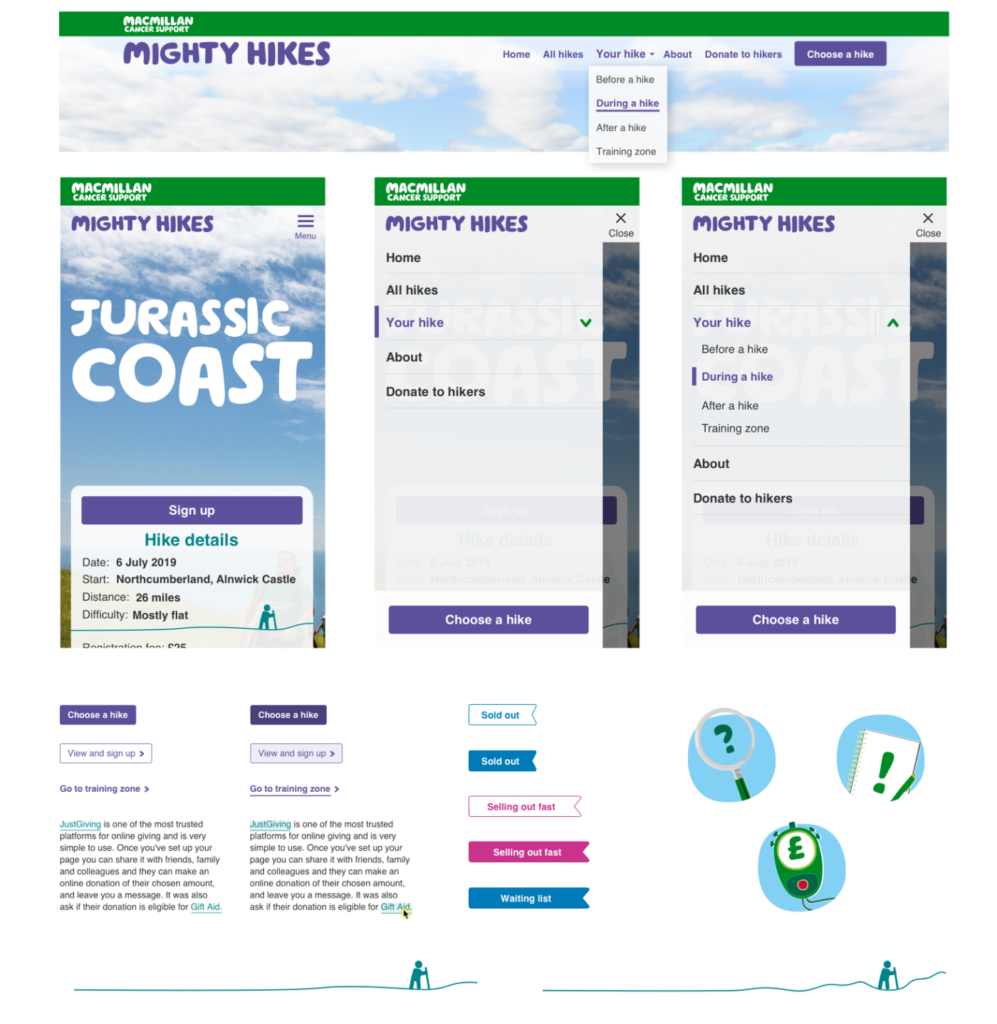
The visual design of the Mighty hikes is created based on three elements, the Macmillan purple for the Mighty Hike, the large full-width photography from the events and illustrations relating to hiking (footsteps and hills)
