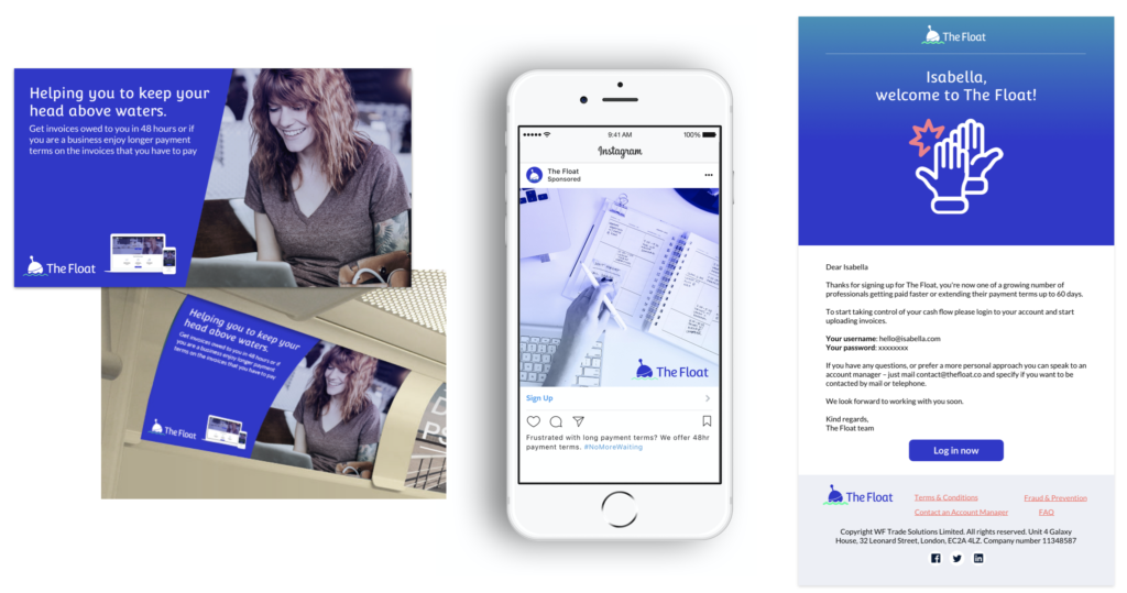
The Float case study
The Float’s objective is to become the one-stop for all freelancer admin needs of Invoicing, contracting, taxation, and quick payments. My role was to conduct an investigation into the existing product from an UI/UX perspective.
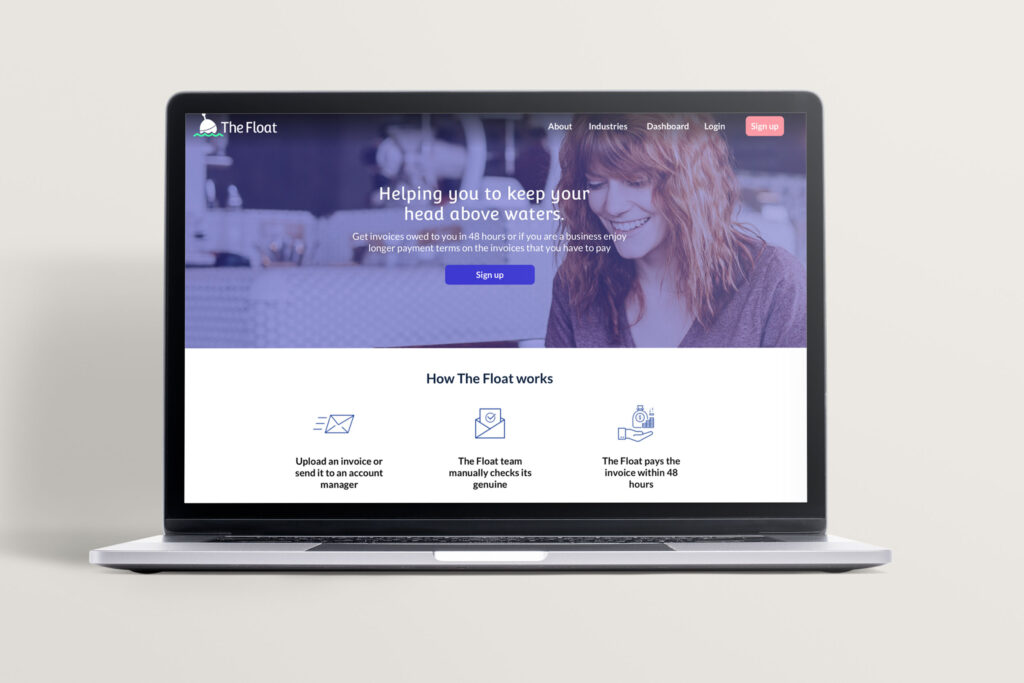
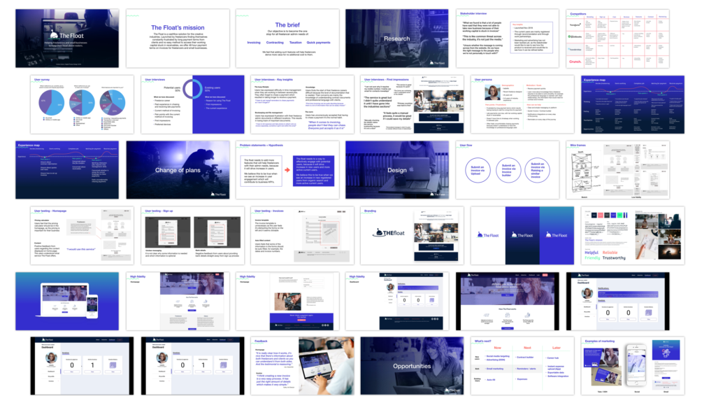
The Float is a cash flow solution for the creative industries. Launched by freelancers finding themselves constantly frustrated by long payment terms from clients and no easy method to access their working capital stuck in receivables, they offer 48 hour payment terms on invoices for freelancers and small businesses.
Discover
Stakeholder interviews
Starting with a stakeholder interview, I wanted to get a better understanding of the stakeholder’s motivation and their vision behind the product.
“What we found is that a lot of people have said that they were not able to take new business because their working capital is stuck in invoices”
The Float’s stakeholder
Competitors analysis
Main competitors were major industry know brands, for example, Yuno Juno, Quick books, Transferwise and Crunch. They all have an established product and brand presence and a handful of features.
User survey and interviews
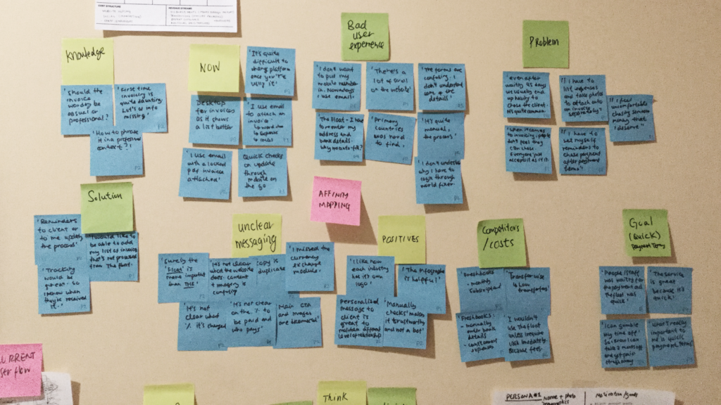
I conducted user surveys with 6 people and interviewed 6 existing customers of the product to find out more information about their current experience with submitting invoices and requesting payments. We also spoke about what their ideal product would look like and what they think of the current website.
Key insights include:
“First time invoicing can be quite daunting because there is a lot of information that can be easily missed ”
Users find the start of their freelance careers difficult because of the level of documentation that is needed. Their concerns are mainly the knowledge of understanding contract documents and professional language with clients.
“The forms are confusing, I don’t understand some of the details”
Users have found the forms and interactions confusing, with no clear indication of why some information were required in order to proceed to the next page.
“The service is great but I didn’t quite understand it until I have gone into the industries sections”
There could be some opportunity to relook at the content, branding, and visual design exploration to make the product appeal to the existing and potential customers.
Define
Persona
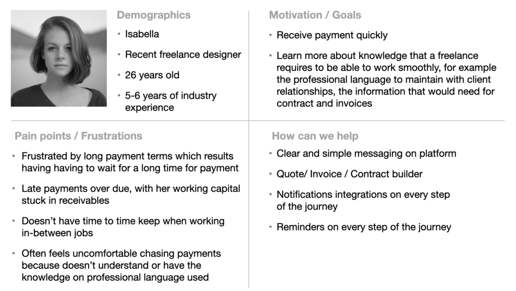
Based on the research, 3 personas were created and shared with the stakeholder. The primary persona would be someone who is new to the freelancing world, who requires quite a lot of support and have the confidence in a product to guide through them.
Experience mapping
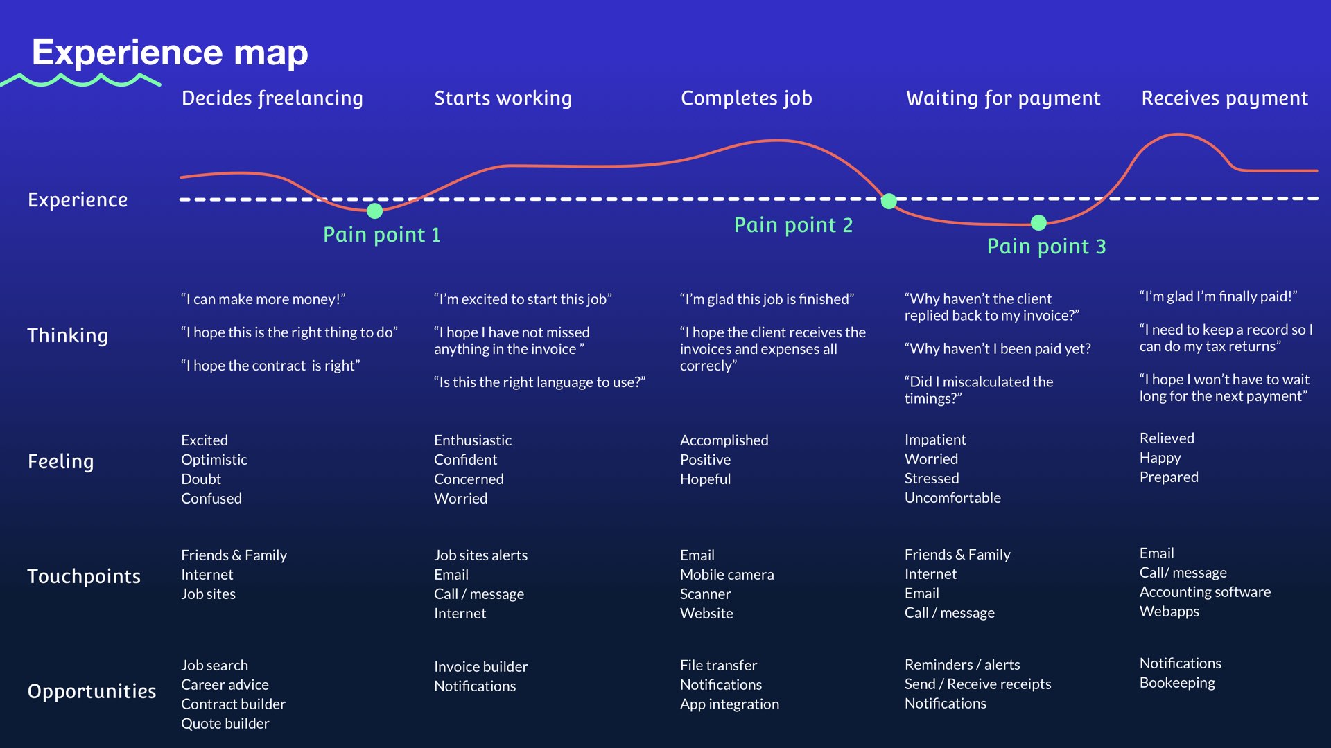
Two problem statements and hypotheses were created and a direction has been decided based on the business’s focus.
1
Problem statement
The float’s stakeholders and users have emphasized the need to have features that will help freelancers with their admin needs.
Hypothesis
We believe this to be true when we see an increase in user engagement which will contribute to business KPI’s.
2
Problem statement
The float needs a way to effectively engage with potential users because it will drive an increase in new users and more active current users.
Hypothesis
We believe this to be true when we see an increase in new registered users from organic search and more active current users.
The business has decided to focus on option 2 which focuses on creating a better user experience for the current customers with the aim to procure new customers.
Develop
User flows
The following three user flows were created based on user and stakeholders needs:
- Submit an invoice via Upload
- Submit an invoice via Invoice builder
- Submit an invoice via Raising a similar invoice
Sketching and wireframing
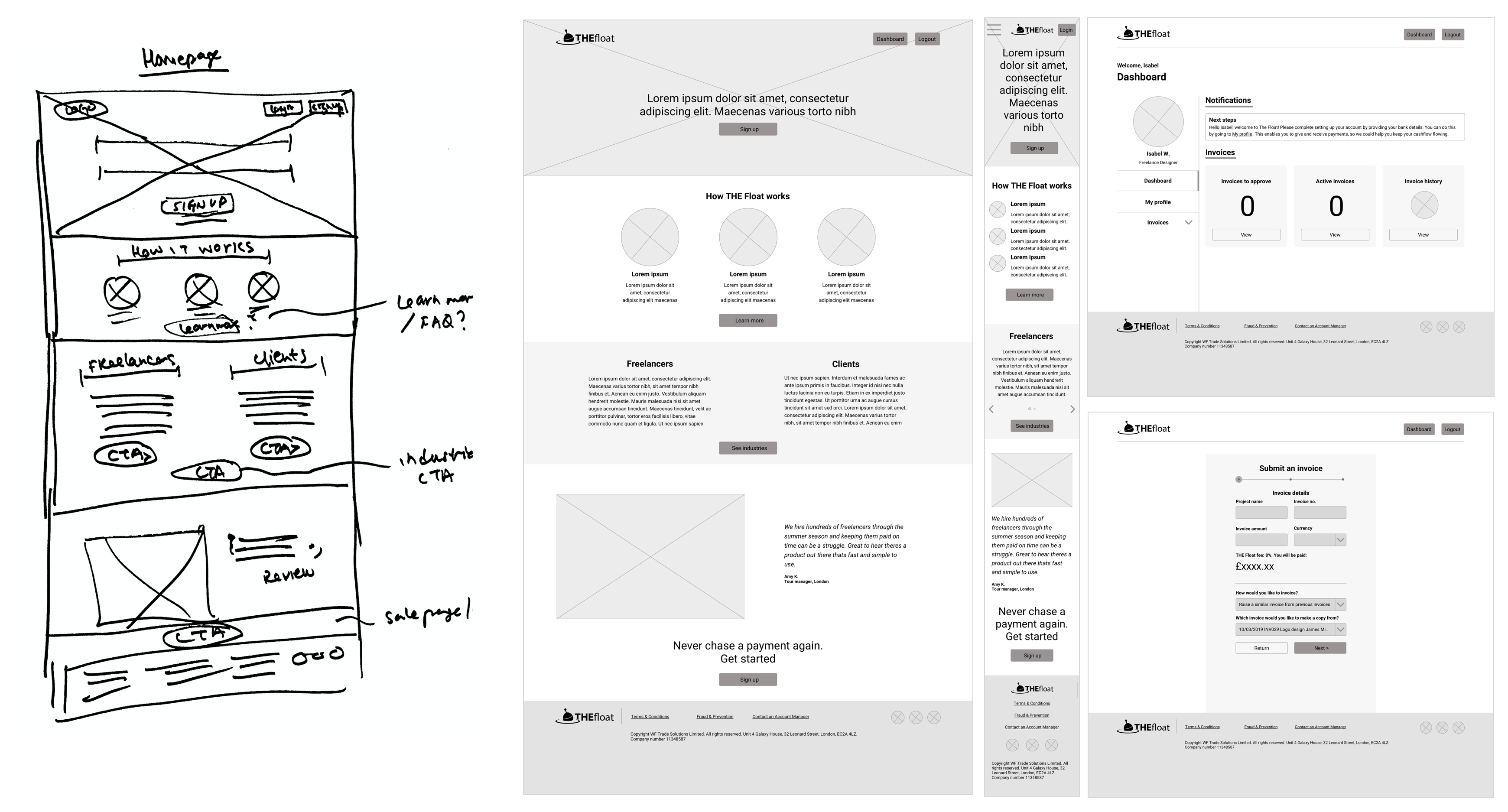
As part of improving the user experience for the new and the potential customers, homepage contents were redefined.
Initial user testing
Homepage
Positive feedback from users regarding the content displayed on the home page. The users understood what service The Float offers.
Invoice builder
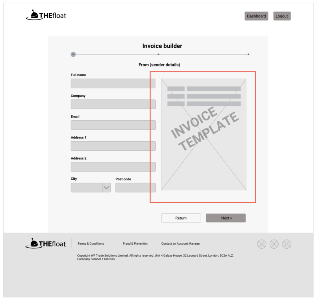
The invoice template is unnecessary as the user feels it’s distracting the forms on the left and it seems clickable.
Design
Branding
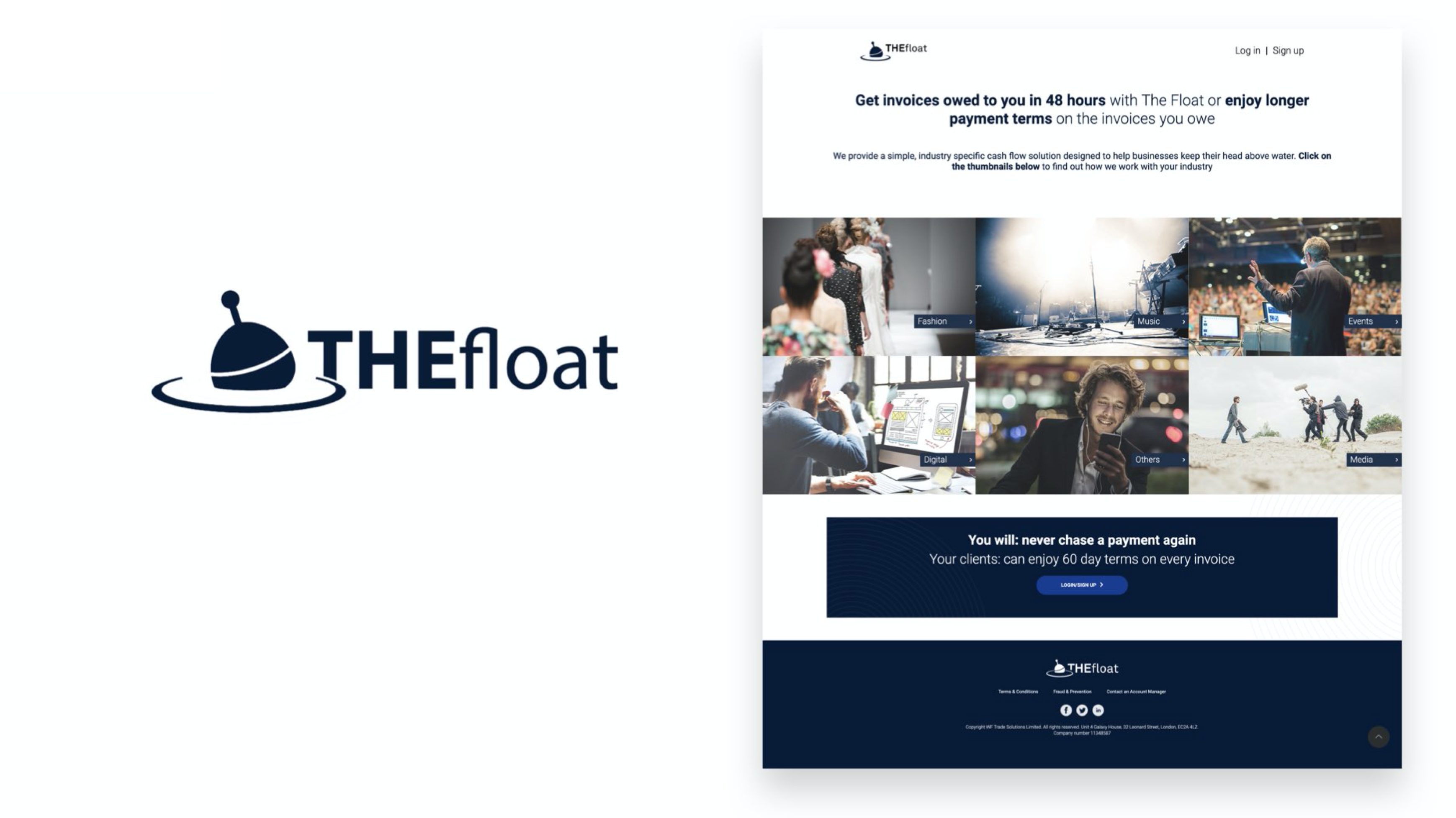
As part of the homepage and content refresh, there was also an opportunity to relook at the branding and the tone of voice. The current branding is only created with a shade of blue and white, it felt a bit corporate compared to the competitors.

Not wanting to move away too much from current branding, I have added some character by switching to a friendlier font and added extra colour to the current colour palette to make it more friendly.
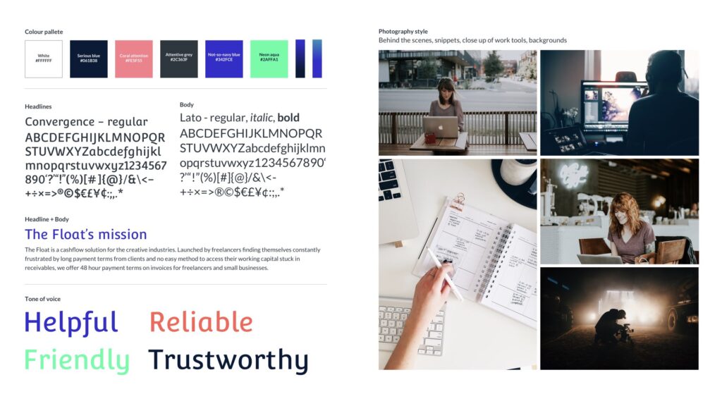
High fidelity design
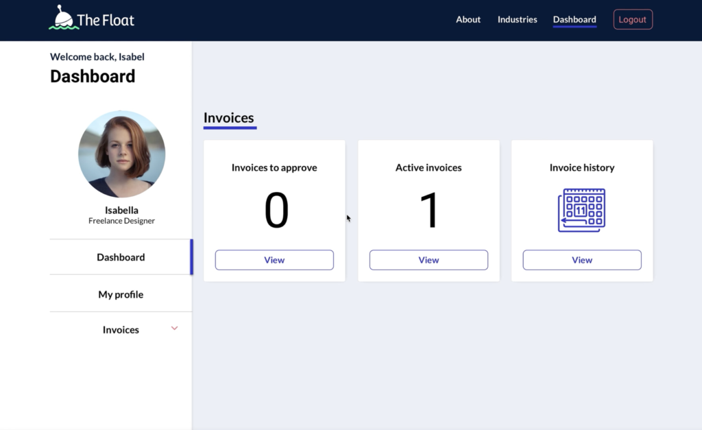
Feedback
For homepage
“It is really clear how it works, it’s nice that there’s information about both freelancers and clients so you can understand it from both sides. And the testimonial is reassuring.” – Lily, Copywriter
For Invoicing
“I think creating a new invoice is a very easy process. It has just the right amount of details which makes it very simple.” – Cathy, Art Director
Looking ahead
I was only able to work on a portion of this project, but looking ahead I have identified some opportunities:
| Now | Next | Later | |
| New users | Social media targeting Advertising (OOH) | Contract builder | Career hub |
| Both users | Email marketing | Reminder / Alerts | Instant expense upload (App) Exportable data Software integration |
| Existing users | Auto fill | Expenses |
